
AI app design examples: 4 real prompts and results
Four prompts run in Outclass, with every screen they produced, the time and credits each took, Figma layer counts and what went wrong.
Most posts about AI design show a prompt or a finished screen, rarely both, and almost never the first attempt. We ran four prompts through Outclass on 16 November 2026 and kept everything: the exact words, every screen that came back, how long each run took, what it cost in credits and how many Figma layers each screen turns into. Two of the four needed fixing, and both fixes are below.
Each example ends with a link to the live design. Open it, press Open in Outclass and you have your own copy to edit.
The four runs at a glance
| Prompt | What came back | First result | Credits, first result | Credits with edits | Figma layers |
|---|---|---|---|---|---|
| Bakery pre-order app | 4 phone screens, then a 5th | 34 seconds | 0.48 | 1.27 | 446 |
| Invoicing landing page | 1 long web page | 41 seconds | 0.59 | 0.98 | 370 |
| Vet clinic web app | 3 desktop pages | 54 seconds | 0.78 | 1.95 | 839 |
| Running club app | 3 phone screens | 34 seconds | 0.43 | 0.43 | 309 |
Times run from pressing send to the last screen finishing. Credits are what the chat reported for each reply, and the pricing page says what a credit costs. Layer counts come from the same converter that Copy to Figma uses.
1. A mobile app from one paragraph
The first prompt names the product, lists the screens and asks for a mood.
Prompt
A mobile app for a neighbourhood bakery that takes pre-orders. Home with today's bakes and what's still available, a product screen with pickup time slots, an order tracking screen, and a loyalty stamp card. Warm and appetising, 4 screens.Four screens came back in 34 seconds for 0.48 credits. The app got a name, Crumb & Co., along with prices in pounds, real pickup slots and a stamp card showing 7 of 10 stamps. The photos were chosen by Outclass from stock libraries. We never asked for photos.
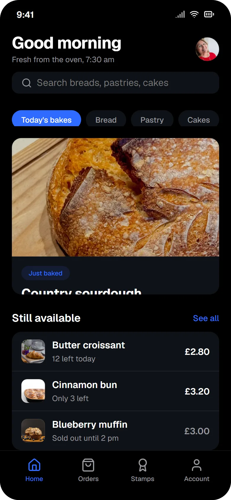
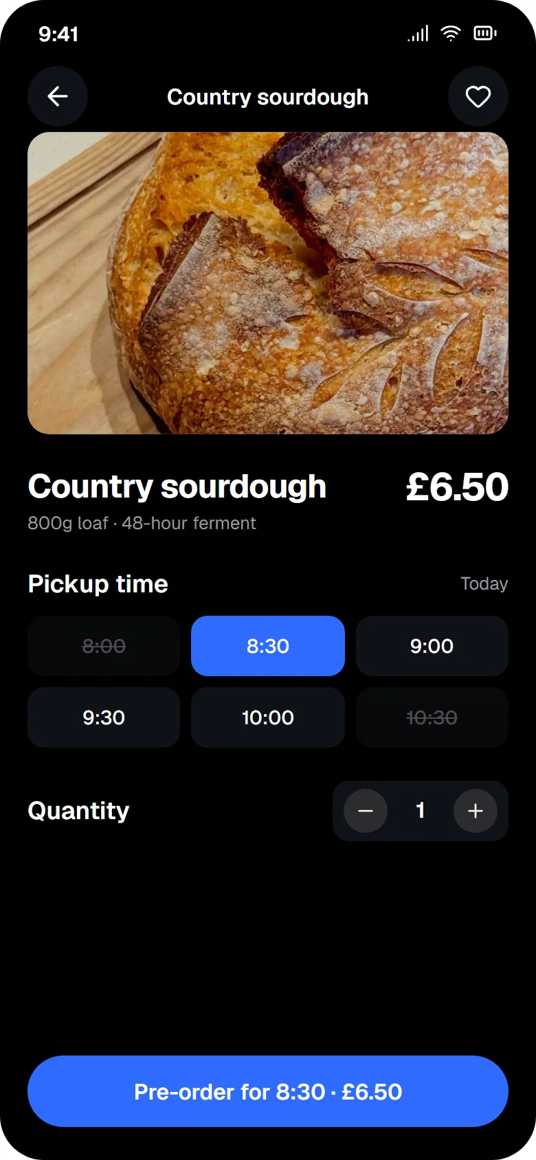
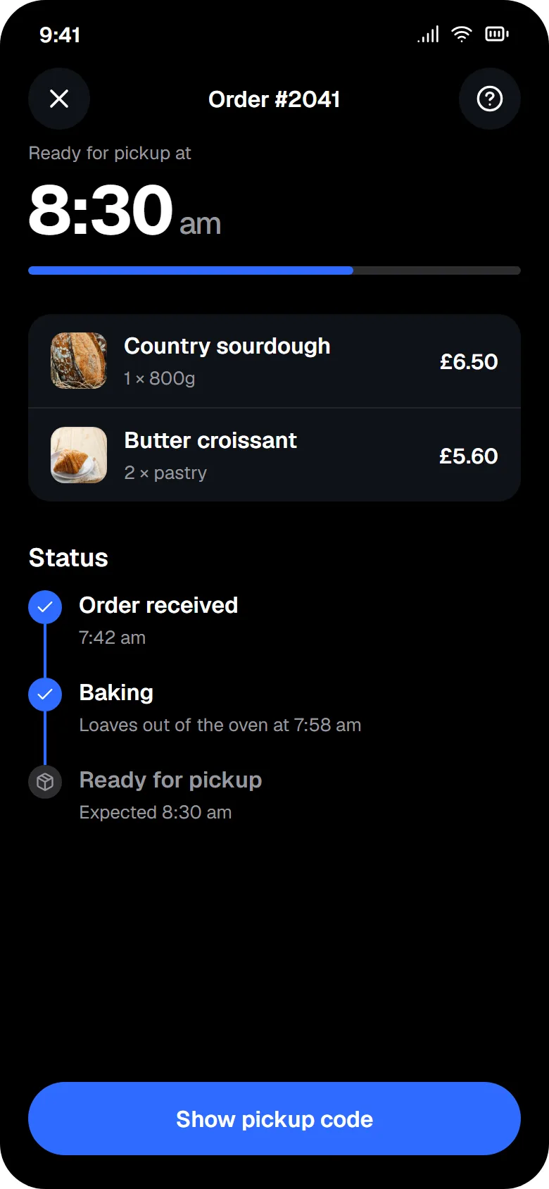
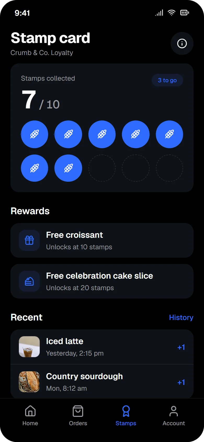
Two things were wrong. We asked for "warm and appetising" and got a black background with a blue accent. Outclass picks a visual direction for prompts that don't spell out a look, and "warm" was too soft a word to override it. Also, on Home the featured card cut off its own title and the category chips were clipped at the bottom.
2. Changing the whole app with one message
We did not start over. One chat message changed the look of all four screens:
Prompt
Make all screens light and warm: cream background, terracotta accent, dark brown text. On Home, the featured card cuts off the title 'Country sourdough': show the full title and its price.All four screens were restyled in 39 seconds for 0.35 credits in total, between 0.08 and 0.10 a screen. The colours changed everywhere. The clipped card did not: the title got longer and was still cut off. A second message, about Home only, named the cause:
Prompt
On the Home screen, the featured card is still clipped and the category chips are cut off at the bottom. Make the photo 180px tall, let the card grow to fit its title and price, and give the chip row enough height to show the full pills.That took 7 seconds and 0.10 credits, and it worked. The pattern held for the rest of the day: an edit that says what to change ("make the photo 180px tall, let the card grow") lands, and an edit that only says what looks wrong often doesn't.
Then we added a screen the first prompt never mentioned:
Prompt
Add a checkout screen: order summary with two items, the chosen pickup time, a note field, and an Apple Pay button.The Checkout screen arrived in 12 seconds for 0.20 credits, in the same cream and terracotta as the others. It had two faults. Both item photos were broken, and the large total read "£9.00.00" above a correct "£9.30". The broken photos were a bug on our side in how added screens reuse image addresses, and we fixed it the same day. One more edit (10 seconds, 0.14 credits) put both right in this project.
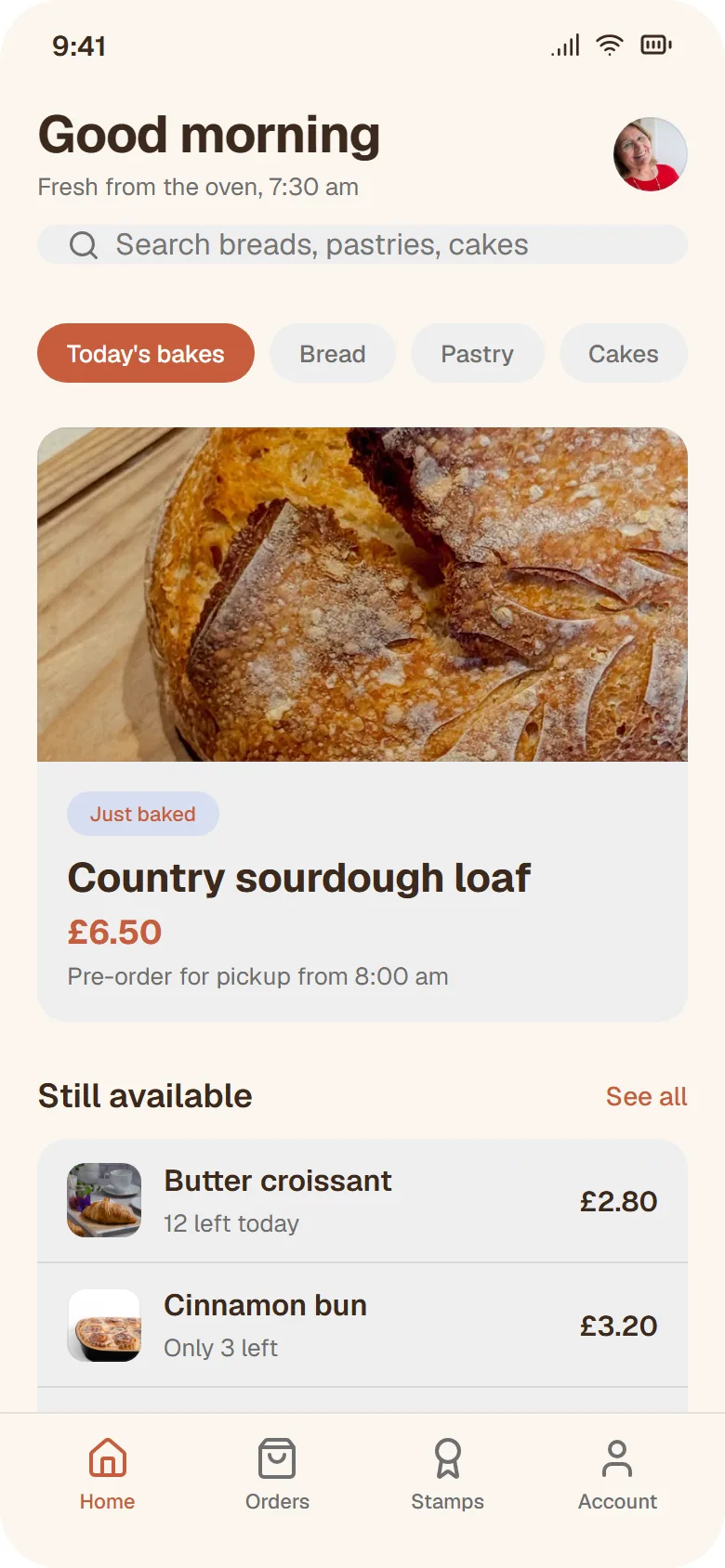
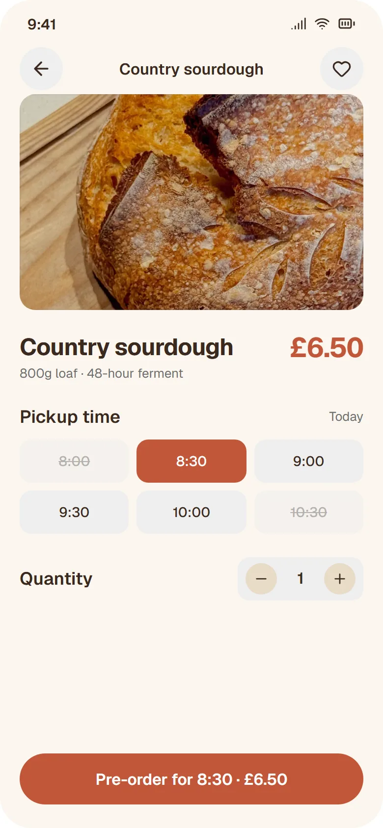
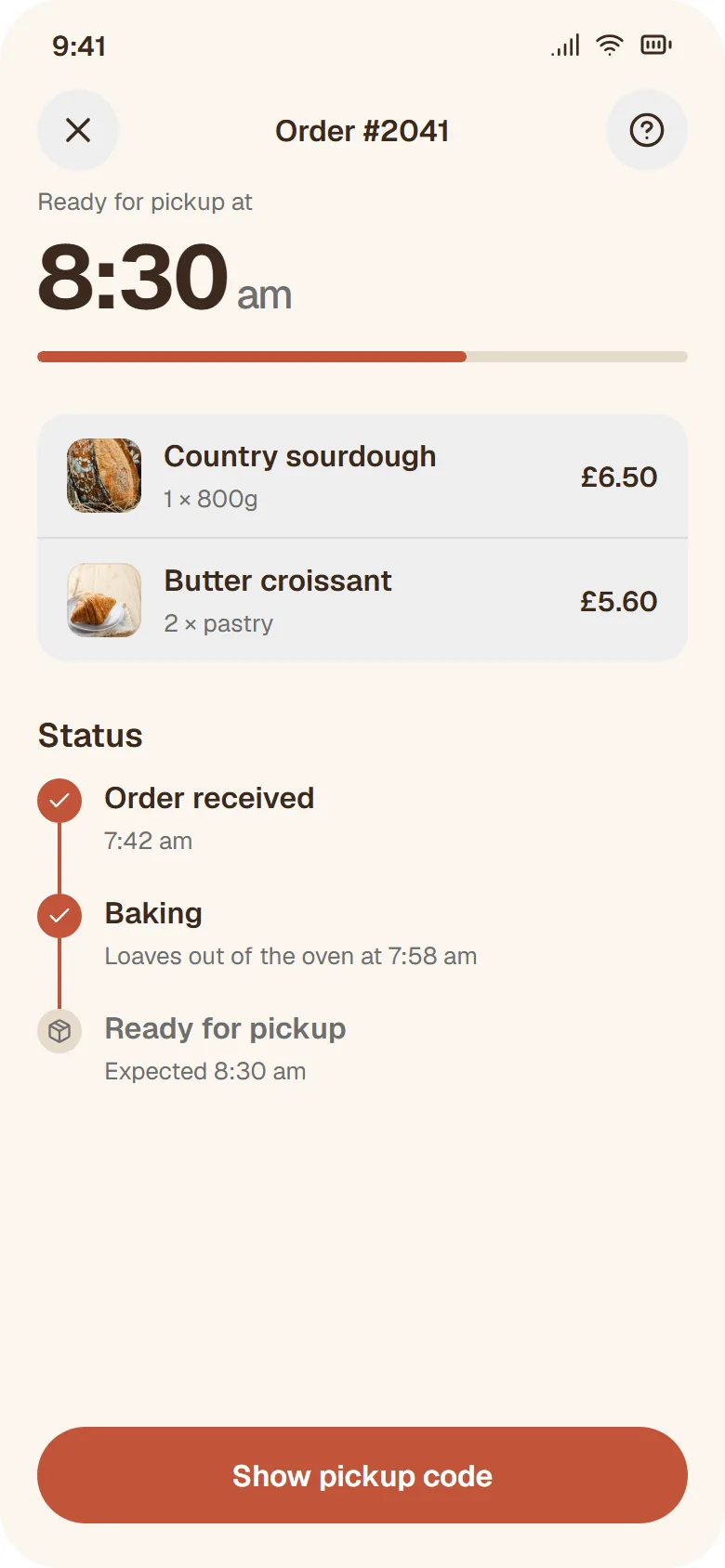
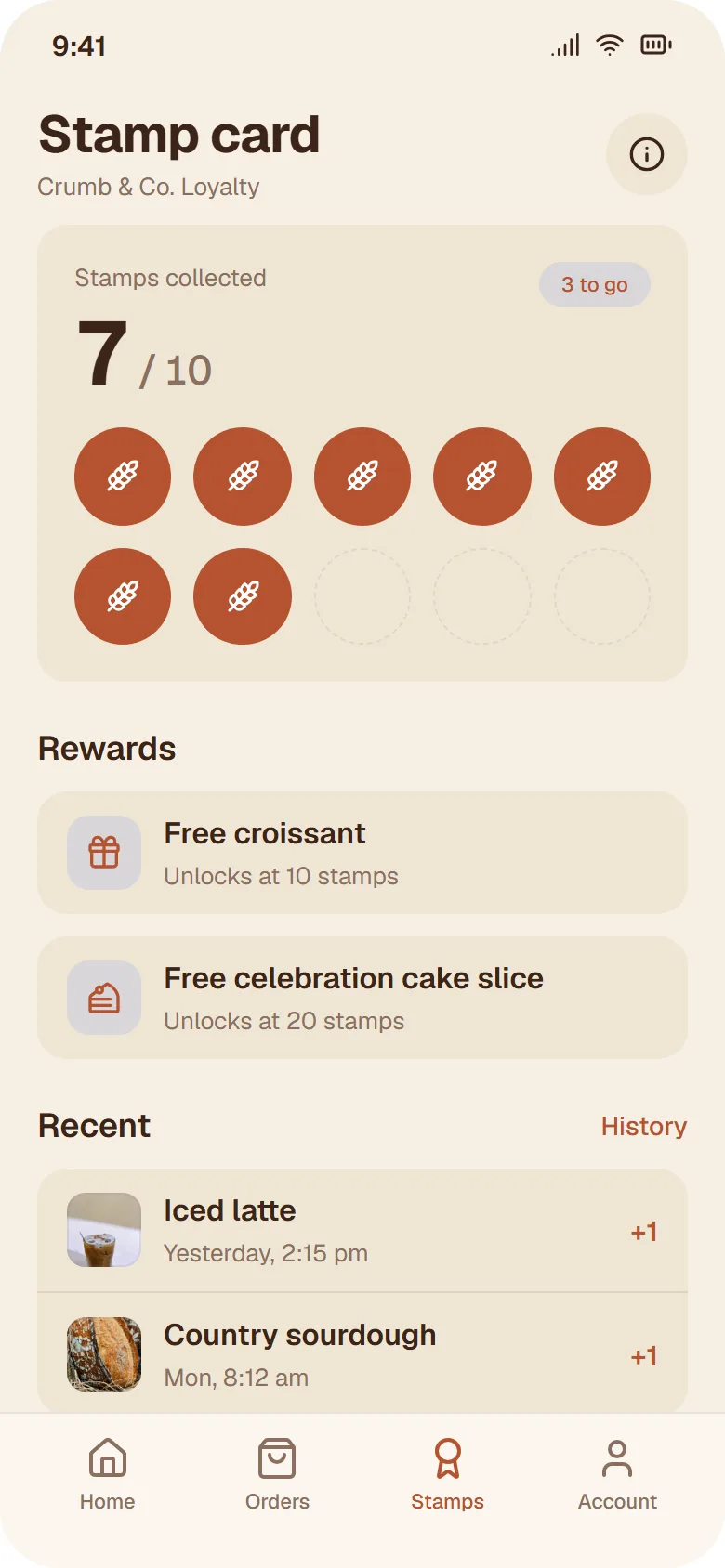
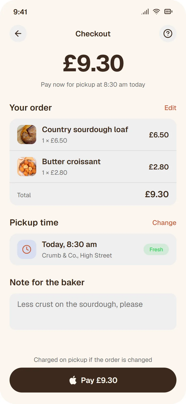
The whole app, five screens and four follow-up messages, cost 1.27 credits. Open the bakery app.
3. A landing page from a section list
A prompt that says "landing page" or "website" gets one long web page, 1280 pixels wide, instead of phone screens.
Prompt
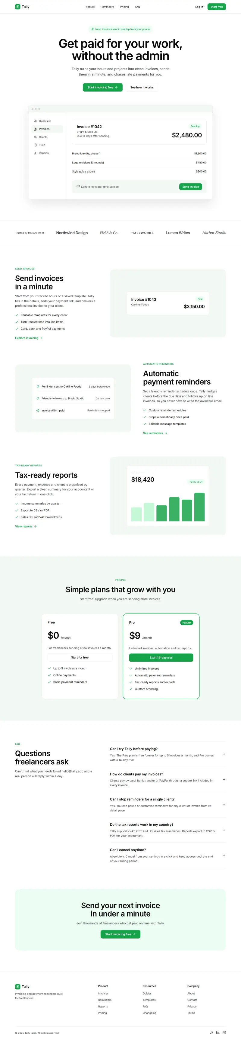
A landing page website for Tally, an invoicing tool for freelancers. Hero with a product shot of an invoice being sent, three feature rows (send invoices in a minute, automatic payment reminders, tax-ready reports), a pricing section with Free and Pro at $9 a month, an FAQ and a footer. Light, calm, one green accent.One page came back in 41 seconds for 0.59 credits. It is about 5,500 pixels tall and has every section we listed, in the order we listed them, plus a logo strip and a closing call to action we didn't ask for. The product shot in the hero is drawn in HTML: an invoice for $2,480.00 with line items and a Send button.
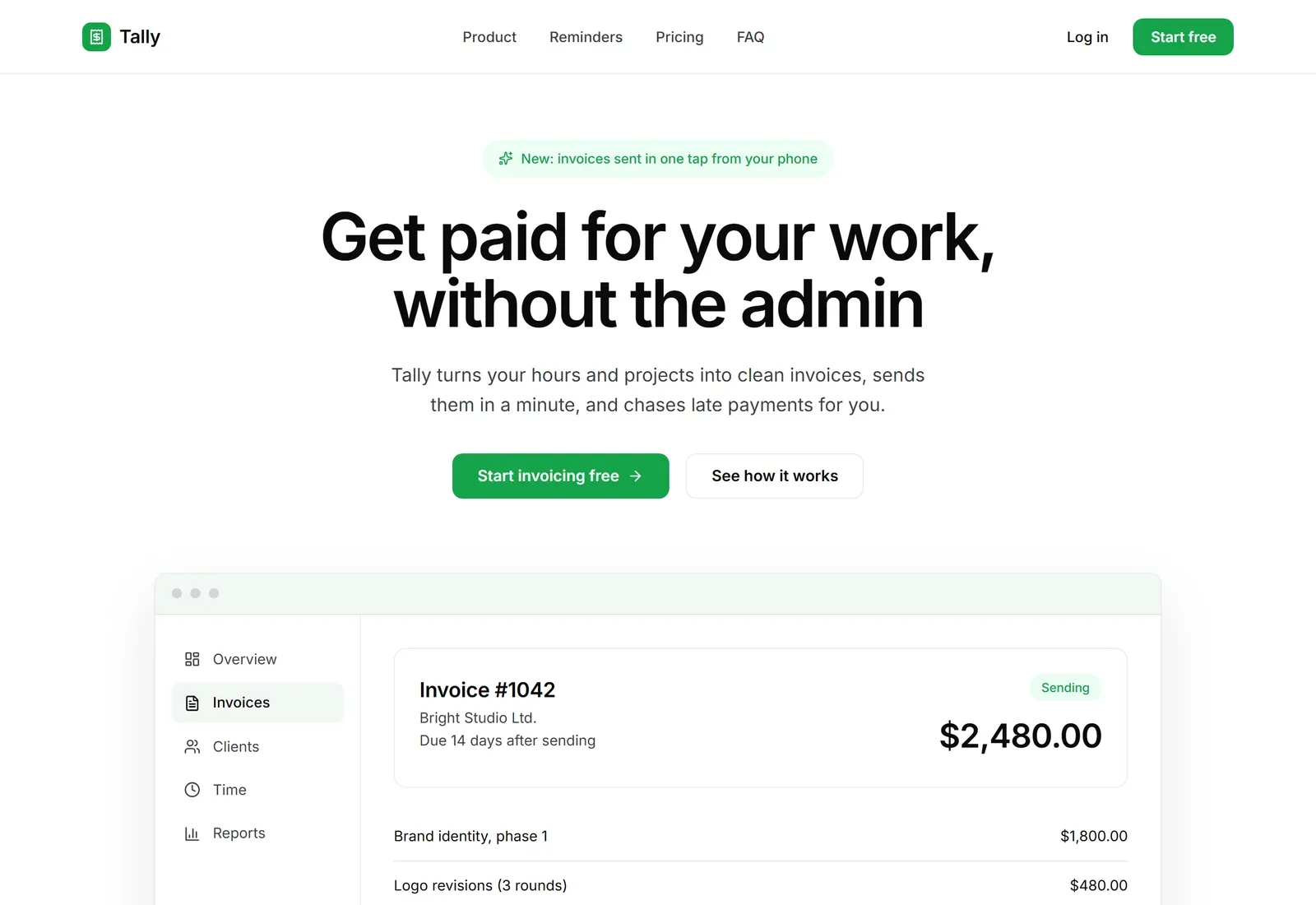
The first result had a serious fault. The navigation links, the subtitle under the headline and most descriptions were almost invisible:
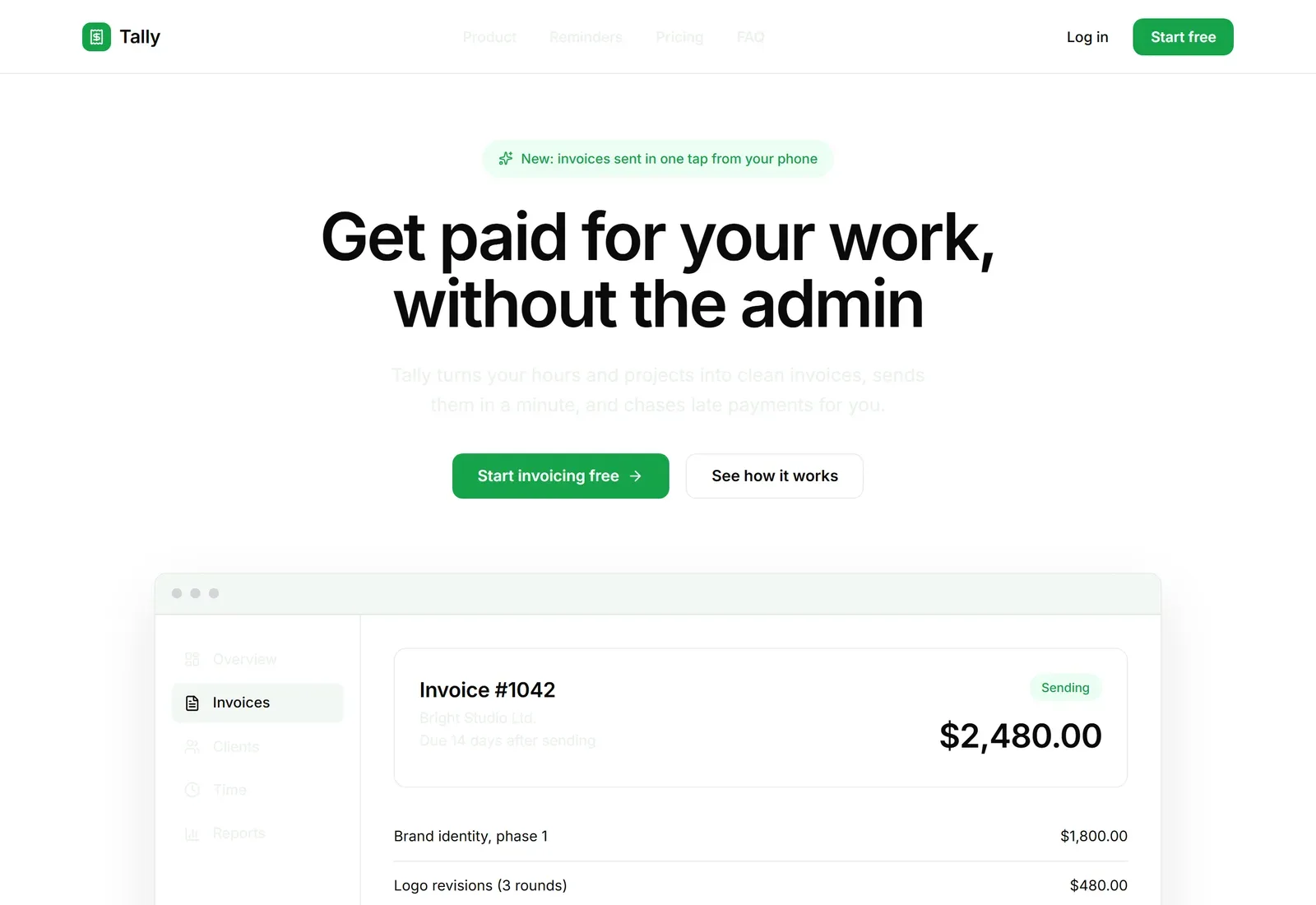
This one was our bug. After a design is generated, Outclass tidies its colour variables into even steps. The page used one of those variables for text, and the tidy-up treated it as a background shade and made it pale. We found it while writing this post and have fixed it, so new web pages don't do this.
Repairing the existing page took two tries. "The secondary text is too faint to read, make it a dark grey" changed a different colour and left the page as it was (0.14 credits). Naming the exact rule worked in 15 seconds for 0.25 credits:
Prompt
Text that uses color: var(--secondary) is still nearly invisible. Change every color: var(--secondary) to color: var(--muted-foreground). Leave backgrounds that use --secondary as they are.You shouldn't need to read CSS to fix a design, and for most edits you don't. When a plain request misses twice, though, the variable names are in the file that Download HTML gives you, and quoting one is the fastest way through.
4. A web app with real data
Dashboards are where placeholder content shows most, so this prompt asks for three specific pages.
Prompt
A desktop web app for a small veterinary clinic's front desk. A dashboard with today's appointments, waiting room status and KPI cards, an appointments table with filters, and a patient record page for a dog with visit history and vaccinations. Clean white, one teal accent.Three pages came back in 54 seconds for 0.78 credits, the slowest and most expensive first result of the four. The clinic is called Hollis Vet. The dashboard has 14 appointments, 9 checked in and an 18 minute average wait against a target of 14. The patient record is for Biscuit, a golden retriever weighing 31.4 kg, with three dated visit notes and a Bordetella booster flagged as due. None of that was in the prompt.
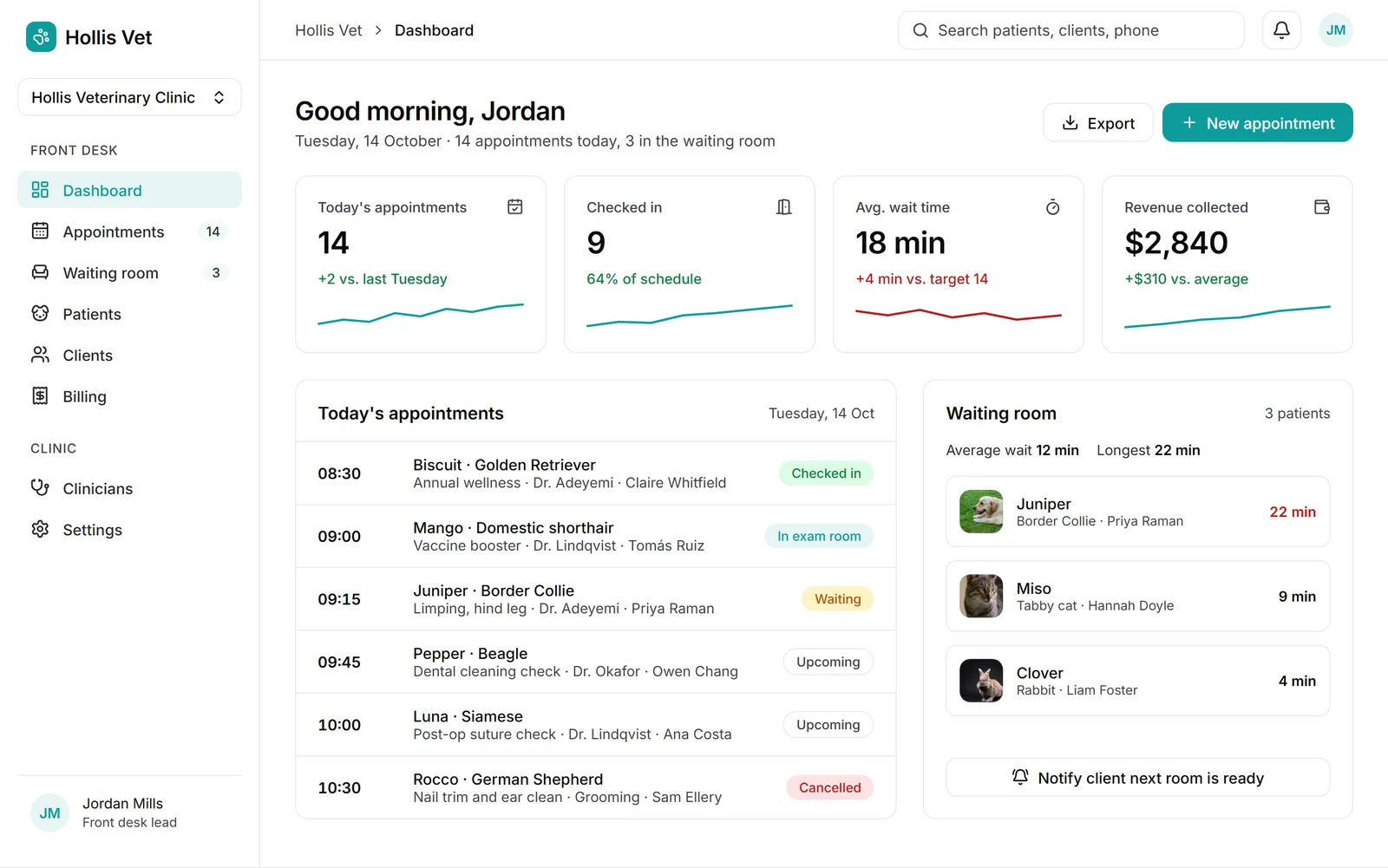
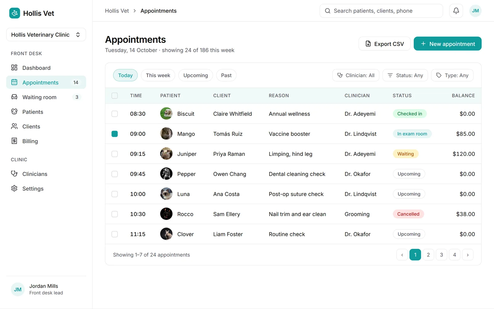
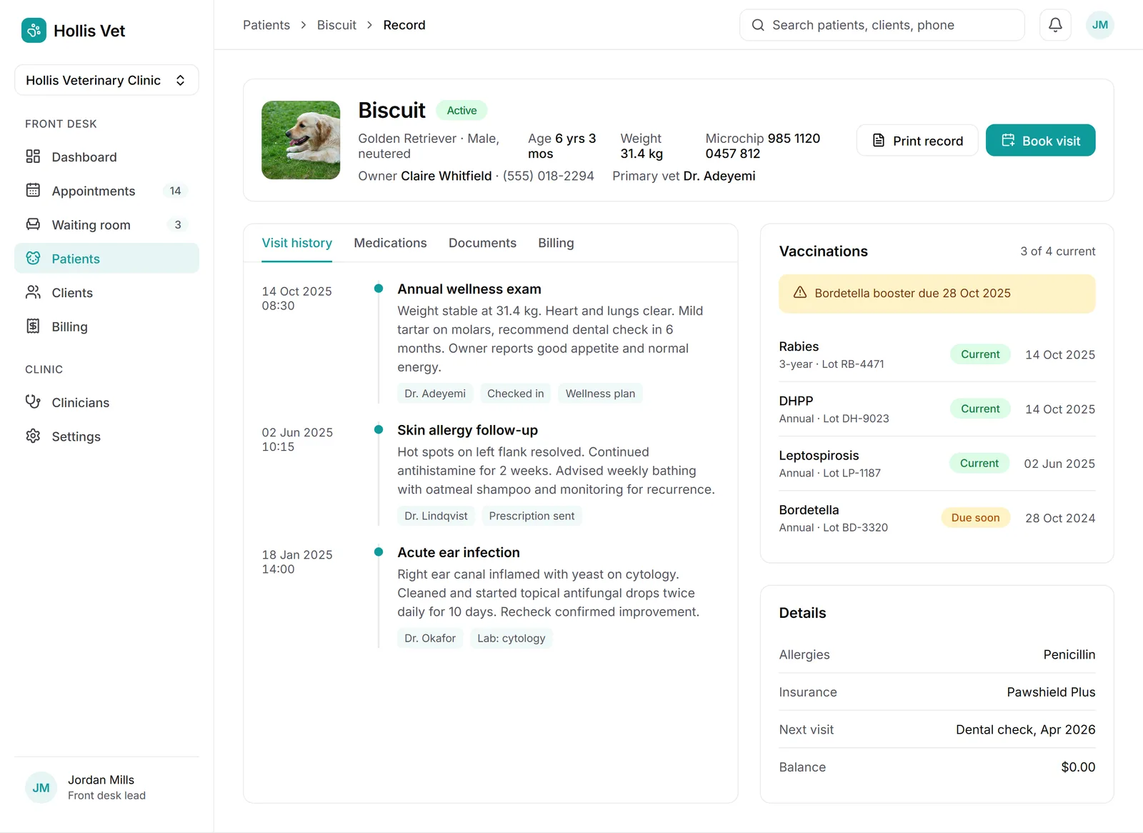
This design had the same faint text bug as the landing page, in the sidebar. Here is the dashboard as first generated:
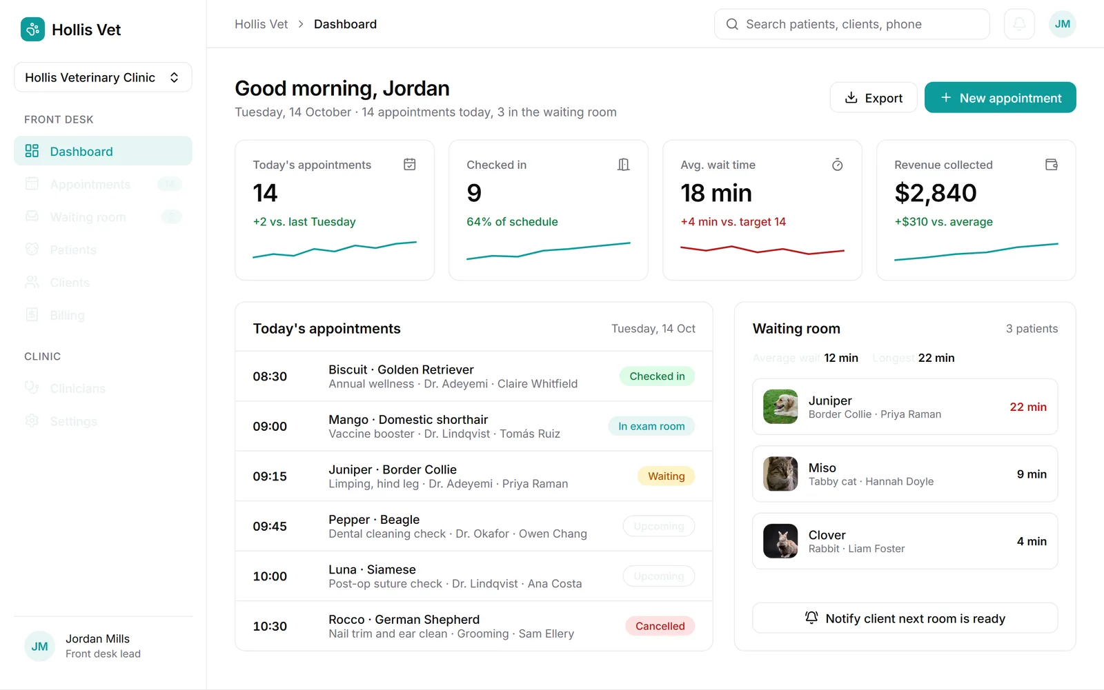
The same two edits went the same way: the vague one missed (0.40 credits across three pages) and the specific one fixed all three in 41 seconds (0.77 credits). That brought this project to 1.95 credits, more than half of it spent repairing our own bug. Open the vet clinic app.
5. A prompt that says exactly how it should look
The bakery prompt said "warm" and got a dark theme. This one states the mode, the background, the accent as a hex code and the font.
Prompt
A mobile app for a running club. A home screen with this week's group runs and my weekly distance, a run detail screen with the route, pace groups and who's going, and a leaderboard for the month. Light mode, white background, one lime green accent #A3E635, Inter, big bold numbers.Three screens came back in 34 seconds for 0.43 credits, and we changed nothing. The background is white, the accent is the lime we named, and the weekly distance is set large: 28.4 km against a 72% ring. When a prompt describes its own look, Outclass follows it and doesn't pick a direction of its own.
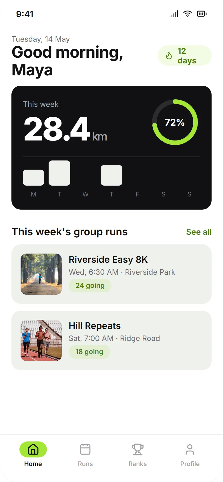
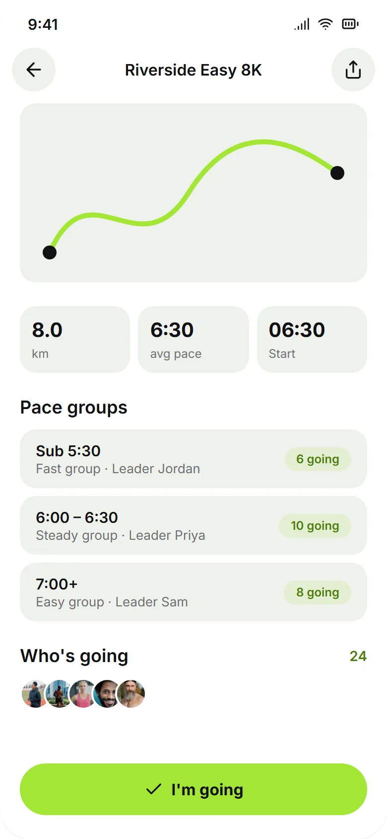
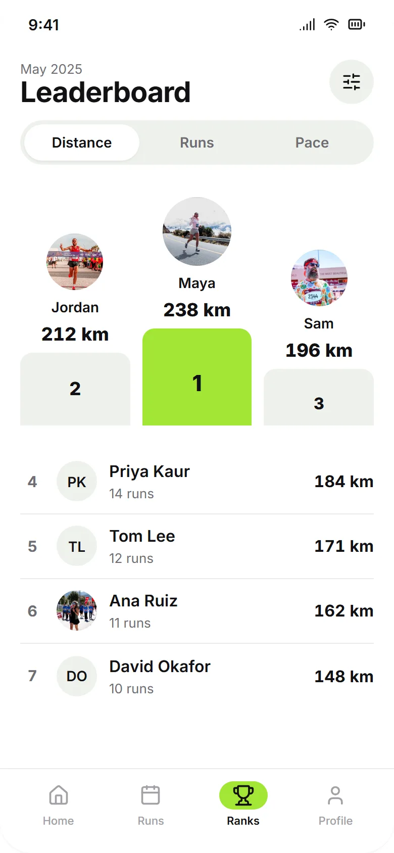
One fault remains: the bars in the weekly chart came out off-white where lime would have matched the ring, which is a one-line edit. Open the running club app.
What these screens become in Figma
Every screen above copies to Figma as layers. We ran each one through the converter and counted:
| Design | Screens | Figma layers | Layers per screen |
|---|---|---|---|
| Bakery app | 5 | 446 | 62 to 137 |
| Tally landing page | 1 | 370 | 370 |
| Vet clinic web app | 3 | 839 | 252 to 327 |
| Running club app | 3 | 309 | 82 to 114 |
Layers take their names from the design, so the bakery's Home screen arrives with layers called header, search-bar, chips, hero-card, hero-title, hero-price, list-group, row and tab-bar. The two web designs used the system fonts Georgia and Arial in places, and the converter swapped them for Inter so the text sits where it should in Figma. It reports that as a warning. For how the export fits into a Figma workflow, see Figma mobile app design.
What we learned about prompts
- Name the product and the screens. All four prompts list their screens or sections, and all four came back with exactly those, in that order.
- State the look or expect a surprise. "Warm and appetising" lost to a dark direction, while "Light mode, white background, one lime green accent #A3E635" was followed to the letter.
- Say "mobile app", "landing page" or "desktop web app". Those words decide whether you get phone screens, one long page or wide app pages.
- Edit with instructions. "Make the photo 180px tall, let the card grow" worked the first time. "It's clipped" and "it's too faint" did not.
- Add screens afterwards. The checkout screen cost 0.20 credits and matched the app, so a longer first prompt would not have been cheaper.
- Check totals and small text. One screen out of twelve had a wrong number in it.
If you want the step-by-step version of this process, how to design an app with AI covers it from the first sentence to the handoff.
How we ran this
All four prompts were typed into Outclass on 16 November 2026, on a normal account, with no settings changed. We ran each prompt once and kept the first result. Nothing shown here was picked from several attempts. The images are renders of the saved designs at twice their size, made with the same converter that produces the Figma layers. The two "as first generated" images were captured before the repair edits.
Twelve screens across four designs cost 4.63 credits in total, including every edit described above. First results alone came to 2.28.
Questions
How long does an AI app design take to generate?
In these four runs, a first result took between 34 and 54 seconds: about half a minute for 3 or 4 phone screens and just under a minute for 3 desktop pages. Edits to one screen took 7 to 15 seconds.
How many credits does one app design use?
The first results here used 0.43 to 0.78 credits each. A phone app with 3 or 4 screens was under half a credit, and a 3-page desktop web app was 0.78. Each edit to a screen used 0.06 to 0.31 credits.
What should an AI app design prompt include?
Name the product, say whether it is a mobile app, a landing page or a desktop web app, and list the screens or sections you want. If you care how it looks, state the mode, the background, one accent colour and the font. A vague word like warm may be ignored.
Can I edit an AI-generated design without starting over?
Yes. In these runs one chat message restyled four screens in 39 seconds, another fixed a single card in 7 seconds, and a third added a matching checkout screen in 12 seconds. Edits that say what to change work better than edits that only say what looks wrong.
Do AI-generated screens become real Figma layers?
The screens in this post convert to between 62 and 370 layers each, named after the parts of the design, such as header, search-bar, hero-card and tab-bar.